Two rebranding projects for real clients—from research to implementation
BRAND IDENTITY FOR LOCAL BUSINESSES
Two complete rebranding projects for local Argentine businesses: Anabella (children's bags and accessories) and Mujer Turquesa (holistic therapy services). Both projects involved deep client research, iterative design processes, and full implementation across digital platforms. These were real paid projects where I worked directly with business owners to solve branding challenges and define visual identities that authentically represented their values and connected with their target audiences.
Client
Freelance Projects - Real Clients
Date
2024 - 2025
Industry
Retail / Wellness Services
Scope of work
Social Media Design
Brand Strategy
Visual Identity
Design Systems
Client Iteration
THE CHALLENGE
Small business owners often struggle with visual identity that authentically represents their values and connects with their audience. Anabella (children's bags) had inconsistent branding that didn't communicate the quality and personality of her handmade products. She needed an identity that appealed to both kids and parents. Mujer Turquesa (holistic services) had been burned by a previous designer who delivered generic work without understanding her niche. She needed to project professionalism while maintaining warmth, and position herself as a specialist in transgenerational energetic cleansing for businesses—a service with almost no competition.
UNDERSTANDING THE CLIENTS
Both projects began with branding questionnaires, interviews, and competitive analysis to uncover what each business truly needed. The iterative process: Mujer Turquesa required three full design rounds before finding the right direction. The breakthrough came when we framed her work through epigenetics and transgenerational healing—blending science with spirituality rather than falling into New Age clichés. Anabella's challenge was different: separating her personal aesthetic from what the brand needed to communicate to her market. Key insight: Both clients needed to see their businesses from the outside. The rebranding wasn't just visual—it was strategic repositioning that gave them clarity on who they served and why.


VISUAL SOLUTIONS
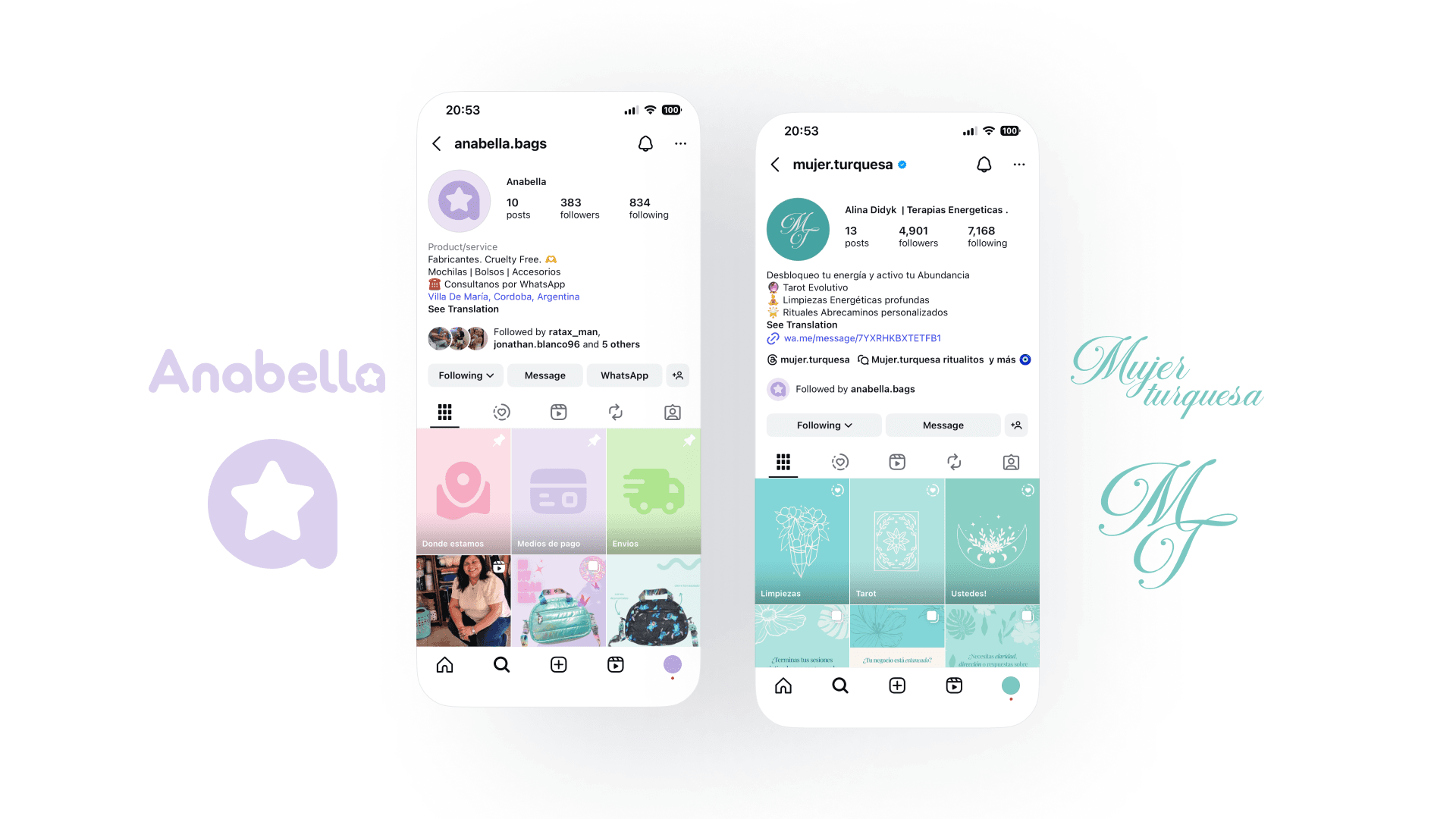
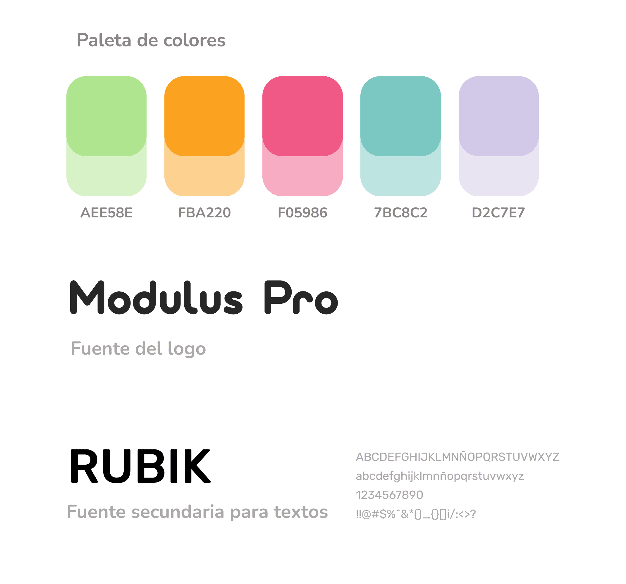
Design decisions were driven by positioning strategy and audience psychology. Mujer Turquesa: Turquoise palette evokes connection and calm without spiritual clichés. Tempting Script adds elegance, paired with Playfair Display and Lato for professional warmth. Line-art floral iconography instead of obvious esoteric symbols. The language says 'energy expert' not 'mystical reader.' Anabella: Vibrant pastels (pink, lilac, turquoise, orange) communicate joy without being childish. Modulus Pro gives modern, rounded friendliness. The star in the final 'a' became the signature element across all applications. Rubik provides clarity for messaging. Both received full systems: logos, palettes, typography, social templates, and usage guidelines. For Mujer Turquesa, I designed Instagram carousel templates that communicated her services clearly. For Anabella, the focus was product photography styling and consistent IG grid aesthetics.

OUTCOMES & REFLECTIONS
Both identities were successfully implemented and are currently in use by the clients. Client feedback: Mujer Turquesa expressed that for the first time, she felt her visual identity matched the seriousness of her work. Anabella now has tools that help her sell without feeling like she's 'pushing products'—the brand does the talking for her. What I learned: Real clients require emotional intelligence, not just design skills. Managing Mujer Turquesa's previous trauma with bad design work meant building trust slowly and iterating openly. Anabella needed help separating her personal aesthetic preferences from what the business required. Both taught me that branding isn't about imposing style—it's about uncovering what's already there and giving it form. Research prevents expensive mistakes. The three iterations with Mujer Turquesa happened because I kept testing directions against her core values and audience needs. Without structured research, I would have delivered something beautiful but wrong. Small businesses need systems, not just logos. Both clients got the most value from the templates and application guidelines—tools they could use independently. The logo matters, but the system empowers them to grow consistently.