Task management app that motivates children through gamification
TODO-LISTO
A gamified task management app that helps parents motivate children to complete household chores through a points-based reward system. This project demonstrates a complete design process: from initial concept to team-led redesign based on real user feedback.
Client
Academic Project → Team Redesign
Date
2023 - 2024
Industry
Family Tech / Mobile App
Scope of work
Team Leadership
UX Research
UI Design
Usability Testing
Branding
Problem
Parents struggle to motivate children to complete household tasks. Traditional methods rely on monetary rewards or punishment, neither fostering intrinsic motivation. The opportunity: Create a digital solution that gamifies chores, allowing children to earn points toward meaningful rewards they actually want—building responsibility through positive reinforcement. The goal: Design an intuitive app where parents can assign tasks and children earn points toward meaningful rewards—all while keeping the experience simple and engaging for both user types.
RESEARCH & ITERATION
This project evolved through two major iterations, demonstrating the power of user feedback and critical self-assessment. Phase 1 (2023): Initial Design Card sorting with 17 participants to validate information architecture 10 user interviews with parents 5 usability tests on initial prototype Created complete branding and high-fidelity designs Key findings from V1 testing: ✖ Only 2 out of 5 users completed task creation without help ✖ Primary action was hidden in navigation ✖ Color contrast failed WCAG standards (3.2:1) ✖ Tone felt too corporate for a family product Phase 2 (2024): Team Redesign Led a team of 4 designers to address these critical issues through: Heuristic evaluation (Nielsen's 10 principles) 5 new usability tests Complete visual and interaction redesign Voice & tone overhaul


KEY IMPROVEMENTS
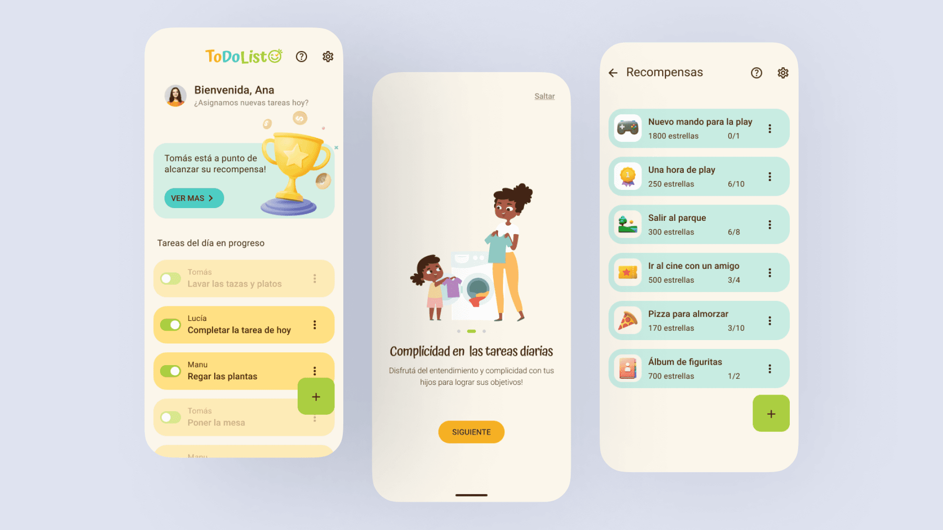
The redesign addressed critical usability and accessibility issues identified in testing. Here's what changed and why it mattered: Accessibility First Improved color contrast from 3.2:1 to 4.8:1, achieving WCAG AA compliance. This wasn't just about standards—users genuinely struggled to see buttons in the original design. Clear Information Architecture Moved task creation from a hidden menu to a prominent floating action button. This single change took task completion from 40% to 100% success rate. Conversational Tone Rewrote all microcopy from corporate language ("Assign Task") to family-friendly conversation ("¿Qué hay que hacer hoy?"). The product needed to feel warm, not transactional. Visual Hierarchy Redesigned task cards with clear visual separation between active and completed states using color, iconography, and spacing—users could now scan their list at a glance.
RESULTS & LEARNINGS
Quantifiable improvements: - Task completion success: 40% → 100% (from 2/5 to 5/5 users) - WCAG AA compliance achieved across all interactions - Validated with 27 total participants across both phases

What I learned
Test early, iterate often. The issues found in V1 would have been exponentially more expensive to fix post-development. Just 5 users were enough to identify critical problems. Leading a redesign of my own work taught me humility. Being open to criticism and coordinating a team to improve my initial design was more valuable than getting it perfect the first time. Accessibility isn't a checkbox—it's better design. The contrast improvements didn't just meet standards; they made the interface genuinely easier for everyone to use.